How data needs design


Taume P. Dery - Design
3 Nov, 2021 - 9 min read
Here in Gapit Nordics, a big part of our job is turning data into information that our customers can easily access and act upon. This article explores how we created a design system that makes this task as painless as possible for all parties involved.
As a UX designer, my job is to make sure that an intended user of a product can easily understand and act upon the information being displayed. In other words, they are transforming data into information. Working at Gapit Nordics, where our primary objective is providing sensor data, this becomes quite literal. Designing dashboards displaying raw data may seem an easy task but making sure the user can easily understand the intended information and turn it into insight is a whole other ball game.
People have many different preferences on how they want their data displayed, based on convention, established standards, personal preferences, and more. Specific preferences may be in regard to the visualization of data, alarms statuses, or symbols. At the same time, Gapit Nordics also provides new sensor data in the existing infrastructure. Therefore, it can be challenging to show both new and old information in a non-confusing or distracting manner. New projects can thus be approached in one of two ways. We can strictly conform to all the customer's preferences and always design unique data elements for each project. This ensures that customers receive the exact product they expect and reduces the time they use to adapt to our product. The other option is to create standardized components for the visualization of data. This makes it so that the customer conforms to fixed restrictions regarding how the data is shown. This ensures faster service delivery on the software side and hopefully makes it easier and quicker to retrieve and act upon critical information.
We've decided to dedicate a large portion of our resources to go from the first option to the second and therefore created a comprehensive design system. This article explores some of the considerations and challenges that came with creating a design system. Our approach is in no way supposed to represent a blueprint of data visualizations. As a large portion of our current customer base is operators and administrators of data centers, the design system reflects that. As we expand our market share to include other industries like hospitals and railways, the system continually develops and improves to match the expansion.
Creating a Design system
A design system has become the standard for managing design at scale by reducing redundancy while creating a shared language and visual consistency across different pages and channels. When creating a design system for our specific purposes, these are some considerations we took into account.
Identifying general standards
One of the first things we did was identify our user's standard measurement units. The most powerful measurement in regard to our target audience by far is kilowatt. In our case, it is used to measure everything from more broad areas, like sites and buildings and down to individual integrations. Therefore it makes sense for us to integrate the measuring unit in most components visualizing data continuously. Other relevant metrics are PUE (Power Usage Efficiency), electrical currents, and temperature.
By combining our knowledge of measurement with standards of information, we offer customers information they need - for example, offering a data bar that calculates the total IT load, PUE, and cooling properties as supplementary data in infrastructure overview dashboards. Therefore, having a clear understanding of measuring units and how they are implemented helps to give a good foundation for the rest of the design system and opens up opportunities to derive analyzed information from raw data.
Creating a hierarchy
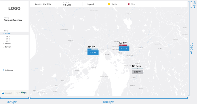
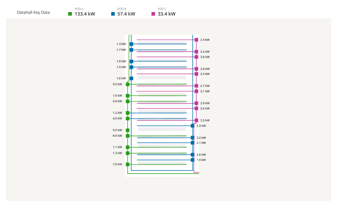
The interface's critical mission is to ensure that the user recognizes precisely how the data fits into their real-world integration and how the information connects to the larger picture. This is done by creating a trickle-down overview whereby the user starts from a country or site overview and navigates all the way down to specific data points. The overview dashboards serve as quick insights for the administrators and provide essential information about how the site operates. Dashboards further down the line show specific infrastructures within the area and suit more operational needs.
From static documentation to dynamic dashboards
One of the dashboards' user interface goals is to make sure that the user quickly understands the information behind the displayed data. Our approach to making this easier is by transforming the existing static critical infrastructure and layout into dynamic interfaces where the operator recognizes their documentation exactly how the data being displayed is connected. This results in the operator quickly becoming familiar with the displayed data and understanding how the values are connected.
Visual consistency
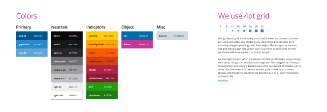
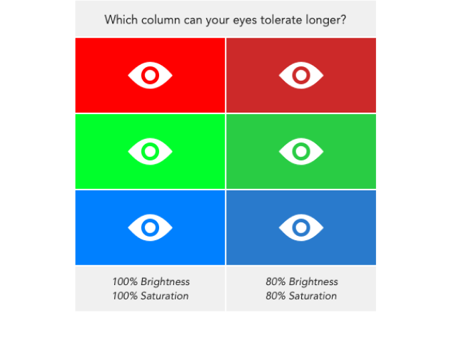
A big part of making data easily understandable lies in how it is visually displayed. Factors like a color scheme, font, margin, padding and negative space play an immense role in making the data visually pleasing and structurally sound. Findings regarding these elements were therefore discussed at length before being implemented. For example, regarding the color scheme, we adapted blue as the primary color for all our dashboards. The color commonly signifies harmony and faithfulness and is used as our primary color to represent clickable elements, with darker and lighter shades used as hover states. The neutral grayscale colors show data and inactive states. The indicator colors are yellow, red, and green to indicate warning, alarm, and ok states. Even though these colors promote an immediate response when detected, we decided to choose a lower saturated version to better view these alarms for a more extended period. All of these measures regarding the visual aspect help the user stay on the operating system for a more extended period without feeling fatigued and at the same time better act quick based on the information being displayed.
Leaving room for variety and flair
Even though the design system and development of components make it easy and standardized, there will always be certain things that have to be customized based on each customer's documentation and requirements. In addition, as our customer base continues to expand, the customer will dynamically change their requirements of how data should be displayed and will make the system more complex. The goal, therefore, is not to have a locked-in standardized design system but rather a system that shows a clear consistency and at the same time allows for continuous expansion.
Summing-up
Having a sound design system for displaying data is excellent for all parties involved.
- The operator or user can better understand how to use, adapt and integrate into a new system.
- The designer can easier create great solutions when there is a set framework in place.
- The front-end developer can develop standard, repeatable components and therefore work more efficiently.
Even though we are proud of the work we have done, the design is always in development. We almost daily learn new insights that prompt us to make adjustments to our system. However, our primary goal here in Gapit Nordics always remains the same. Finding the most efficient way to turn data into information.